
Black Bottle
Website Redesign
Black Bottle is a chic gastrotavern in Seattle. They focus on serving high quality tapas and drinks.
I redesigned the e-commerce experience for Black Bottle’s website based on a provided customer persona, ethnographic research, and usability testing.

PROJECT DETAILS
My role: UX Researcher and UX Designer
Company: Black Bottle Gastrotavern
Project Duration: 2 weeks
Website Type: Restaurant website
Problem
Black Bottle has customers that call their restaurant to order food for pick up, but it does not have an online ordering system. Black Bottle needs a way to streamline the ordering process for its customers and staff for both pick-up and delivery orders.
Goal
To redesign the existing website to improve the e-commerce experience through ethnographic research, usability testing, and design iterations, while addressing the goals and needs of the business and the provided customer user persona.
Results & Impact
I uncovered a specific business problem through field research by interviewing customers and the restaurant manager.
I designed a new online ordering system for the restaurant based on a provided user persona, the ethnographic research findings, baseline usability testing, and multiple competitive and comparative analyses.
I improved my redesign through multiple rounds of usability testing and iterating my design based on user feedback.
Scope of Work & Tools Used
I completed: baseline usability testing, customer interviews, a manager interview, card sorting, competitive and comparative analyses, and usability testing.
I created: a new site map, sketches, wireframes, a mood board, a high-fidelity prototype, a style guide, and a presentation slide deck.
Tools I Used: Sketch, Proto,io, Keynote, Pen & Paper, Whiteboards, Affinity Mapping, and Card Sorting.
Project phases
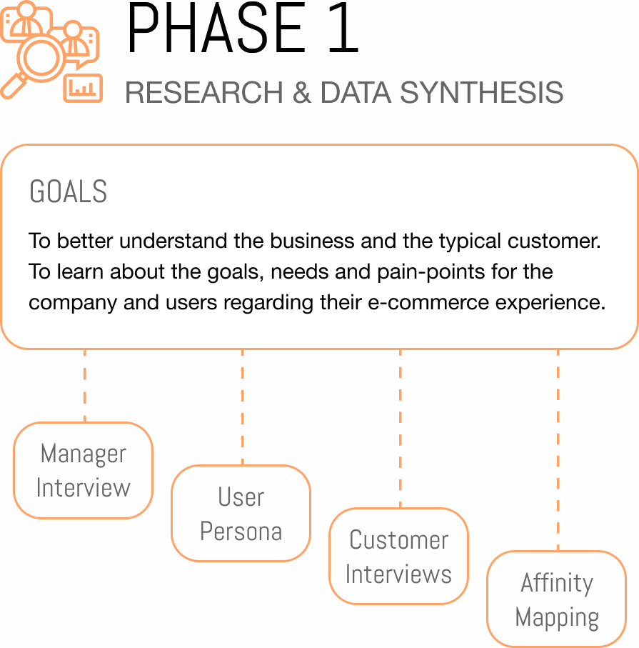


Manager Interview
Goal: To gain insight on the overall brand, business goals and market, and customer demographic.
There were 5 key findings:
Most of their guests would be between the ages of 25 to 65, and they have a primary user persona that they base their designs on - Lauren Berlinger.
Their main competitors are other establishments/gastro pubs like theirs around the city.
They aim to make the atmosphere feel warm and welcoming, and believe their service and hospitality sets them apart.
Their brand statement is “A Meeting Place for All.”
They have multiple customers that call in to order food for pickup, and struggle with managing these orders through phone calls.

USER PERSONA

Goal: To incorporate the needs and pain points of the client provided user persona during the redesign of the website.
Lauren is a 29 year old scriptwriter who cares about authenticity, exclusivity, and uniqueness of purchases.
Things that are important to Lauren that were focused on throughout the redesign included wanting:
Efficient checkout processes.
Multiple product photos.
Wants to be sure of product details.
Wants quick delivery.
“It’s not whether I can afford it, it’s I whether I can afford NOT to have it!”
User Interviews
Goal: Interview customers from Black Bottle that represent the average demographic to gain specific insights surrounding online food ordering that could not be obtained directly from the user persona.
Results: I interviewed five people that have been to Black Bottle, and who also order food online. I uncovered additional pain points for these customers, and better understood what motivates them to order food for pickup or delivery from a restaurant like Black Bottle.

Affinity Mapping

Goal: to organize and consolidate notes from the customer interviews to better understand the goals, needs and pain points of the customers.
Results: Through affinity mapping the interview results, I uncovered the five following key trends:
I like being able to save my information online with the ordering service.
I want to be able to track the delivery, and status of the order.
I want my food to be delivered quickly, and on time.
I want to be able to customize my food, and provide comments for special instructions if needed.
I order restaurant quality food online if I have to entertain people last minute, don’t have time to eat at the restaurant, or if I can’t get into the restaurant because it’s too busy.


Competitive & Comparative Analysis
Direct Competitor Analysis
Goal: To review and compare the features and elements from the websites of direct competitors within the Seattle area to ensure the redesign for Black Bottle's website will be competitive.
Findings: I determined that Black Bottle lacked various common elements relative to its competitors, like links to social media, embedded social media, full-screen photos, and more.

Comparative Analysis - Restaurant Online Ordering Systems
Goal: To review and compare the features and user flows from other online food ordering systems to learn how they handle the various user flows, and what features they include to help users achieve their goals.
Results: I learned that each website handles the customer journey uniquely, often starting users off on a different first step - such as looking at a menu first, or starting with picking delivery or pickup first. I also discovered different ways to display the menu content and order summary, various ways to utilize overlays and sticky elements.

Comparative Analysis - Other Online Ordering Systems
Goal: To compare how other industries (flower delivery and grocery delivery) handle the online checkout process for products that need to be delivered quickly and freshly. To see if they incorporate features or specific steps in their user flows that could benefit Black Bottle's new online ordering system.
Results: I found that they follow very similar user flows as the other restaurants I reviewed, and the features are alike too. The one unique feature I uncovered was "Customer Reviews." However, I did not feel that this feature would help the user persona achieve their goals, nor does this feature suit the business goals or the website's tone.

Baseline Usability Testing
Goal: To complete baseline usability testing with 5 users on an existing online food ordering system for a different website to observe how they interact with the system, see if they encounter issues, and learn which features are important to them.
Key findings:
Users want to start their journey off knowing whether or not the restaurant delivers to their address.
Users like being able to check out as a guest and have the option the create an account if they are a repeat customer.
Users want to be able to customize their orders.
Users want to have the flexibility to change between pickup and delivery at checkout in case they change their mind.
Users like to have a tip calculator.

Brainstorming & Sketching
Goal: Brainstorm new interaction design ideas for the website to improve the UI, UX, and overall visual design that also aligns with the user goals, business needs, and findings from the comparative and competitive analyses.
Result: I produced a variety of quick paper sketches that helped me quickly visualize different design alternatives, assess the pros and cons of each, and move forward with my digital wireframes easily.


Information Architecture
Goal: To restructure and improve the site map by understanding people’s mental models through card sorting.
Result: After completing one round of card sorting with five participants and analyzing the results, I was able to come up with the new navigation, overall information architecture, and site map for the new website that better aligned with people’s mental models.

Original Site Map

New Site Map

Wireframes & Prototyping
Goal: To create low-fidelity wireframes and prototypes to test my designs and gain user feedback early in the process, and rapidly iterate the design.
Result: I was able to iterate my prototype three times over two days of usability testing and improve the design with user feedback early in the design process.

Usability Testing
Goal: To improve the usability of the design, and validate the design solution through user testing and user feedback.
Result: I completed three rounds of usability testing with five participants per round, on the low-fidelity prototype, quickly iterating the design and improving the overall usability.

Visual Design
Goal: To improve the visual design of the existing website to better represent the tone and brand of Black Bottle.
Result: I created a mood board (shown in adjacent image) to help create a new color palette that aligns with Black Bottle’s brand, and picked typefaces that compliment their logo and overall brand as well.


Before
After

High-Fidelity Prototype
Example Screens

Next Steps
Continue testing and iterating the design with more people. I would also test additional task flows that involve more complicated steps to catch any underlying issues that have been overlooked.
Test actual customers that order food for pickup from Black Bottle already.
I would obtain SUS scores during usability testing to measure the change in usability. After completing this redesign, I learned about the System Usability Scale (SUS) Score. I would set a target SUS score, and obtain SUS scores during usability testing to measure the success of the redesign.
Lessons Learned
Your design is a starting point that will ultimately have to change, so there is no point in getting attached to anything specific you create, as it all depends on what works best for the users.
User personas help guide design decisions. Always align your decisions with your personas goals and pain points to ensure a consistent design throughout your product and company.
Making a prototype behave as close to the way a website will behave is important for getting realistic feedback. Take the time to create a prototype that represents the correct interaction to create a realistic experience.
Increasing the complexity of your task analysis helps uncover hidden issues. The more complex the task is, the more steps and potential issues the user will find throughout the test.
The fidelity of your prototype can impact your test and the overall results. This should be considered when making changes to your design. It will take practice and repetitive testing to determine if the design or fidelity needs to be changed or the design itself needs to be improved.
It’s hard to get realistic feedback from theoretical usability testing. Some of the users really didn’t seem committed to their given task, and I feel like this resulted in less credible feedback and their behavior was overall not realistic.
Other Projects

McMenamins
Native App Redesign

Connected-Citizen
Web App Redesign